
Kroger Rebrand
Kroger, a grocery store business that has been around since 1883, has recently redesigned its logo. The new design mixes modern influences with elements of the past, featuring a shopping bag icon as a nod to the company's roots. The updated design showcases a cool blue color that modernizes the traditional Kroger blue while still keeping the classic Kroger blue in the brand icon. The new shopping bag icon has a frontal view with straight lines, giving it a modern and sleek appearance. The rebranding ensures that existing customers still feel like they are shopping at the same store while appealing to younger new customers.
Original Logo & Updated Logo
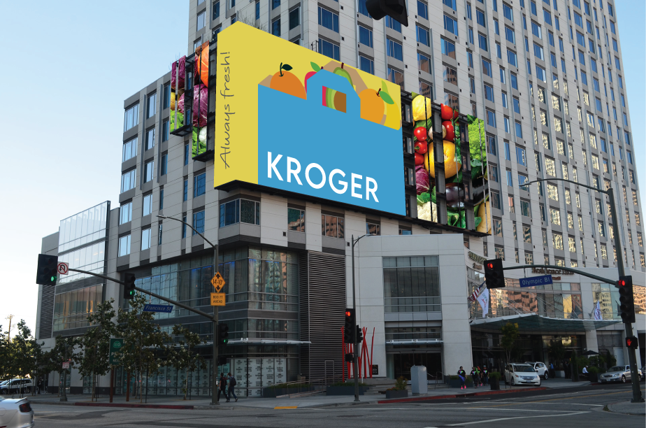
Final billboard collateral
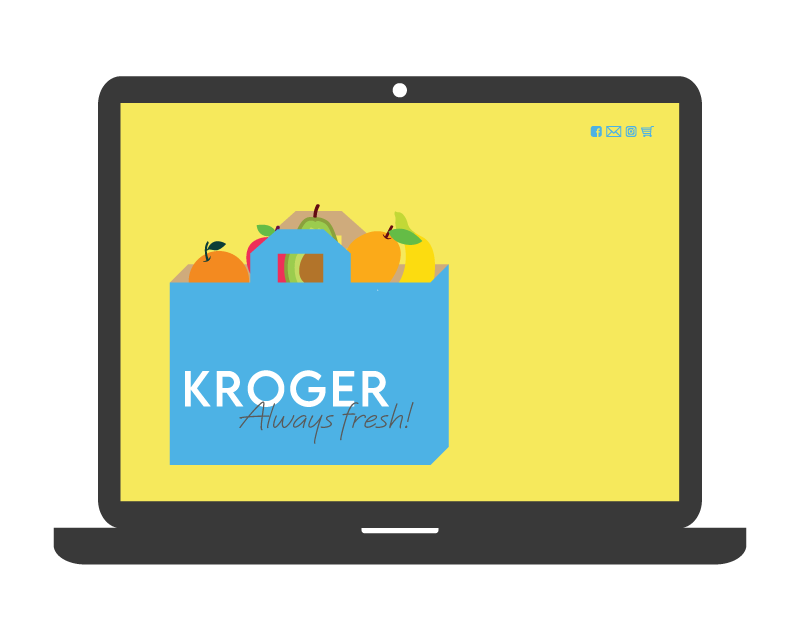
Final website collateral
Final Logo
Process
Original logo sketches

Moodboard
Digital logo variations

Website load-screen animation storyboard
